….being a portrait of an era, and also the revelation of some personal aesthetic inadequacies.
Well shit, y'all, it's been awhile. In addition to summer, when my crafty activity level goes way down (because HOT) I got this new job, see, and sometimes I travel - which is GREAT, and I really love it. But it's hell on one's quilting schedule, which is why it has been 2 months since my last post. Honestly, though, this next one falls into the realm of "argh, I don't know how this style goes and WHAT EVEN IS THIS COLOR SCHEME" and as it turns out, that is ALSO hell on one's quilting schedule.
The style in question here is Mid-Century Modern, or at least the fakey fakerson version of modern-er MCM that now populates the homes of hep cats everywhere with streamlined reproduction injection-molded white leather
Eames chairs from
Design Within Reach;
or from which Ren and Stimpy ripped off its characteristic space-age background doodles; and of course, let us not forget the furniture-and-fashion craze that Mad Men has stirred up. It seems MCM can also be blamed for sprinkling the American suburbs with ranch houses and kidney-shaped swimming pools, and was the movement which launched a thousand nauseating shades of bathroom tile. In short, it is not really my bag. I'm, like, a big shabby chic sort of girl, and the idea of spindly white furniture freaks me out.
 |
| Don Draper, though an asshole, is my bag. However, GET YOUR SHOES OFF THAT WHITE COUCH. |
 |
| Apparently, playing with Jacks was very popular on Sputnik... |
 |
| ….as were hallucinatory floating kidneys and guitar picks. |
Though, truth be told, this is not a movement I am even all that familiar with, beyond the extremely superficial way you know about things you were introduced to by cartoons (thank you,
Tom and Jerry, and see also: classical music and
Looney Tunes.) I tend to conflate "mid-century modern" with "anything from the 50s at all." This is true even though everyone in my group of college friends, and particularly those of us working in coffee houses, went through at least a brief phase of
Esquivel and Dave Brubeck and Getz/Gilberto's
The Girl from Ipanema. It is also true even though I myself have a couple of exceedingly 50s lamps that I cherish…I just never really placed them in the context of a design movement, I just bought them both because they were cheap at the time, and they made me snicker. One is a pineapple! I love Pineapple Lamp.
 |
| What's not to love, amiright? And Hawaii! Hawaii is so 50s! |
 |
| This drum shade is made out of fiberglass. FIBERGLASS! |
So apparently I'm not a mid-century maven as much as a lover of drum shades. However, what's important is that my friend Lupe is a fan - not in a demented, I Live In A Reproduction of the Brady Bunch House way, but in the more methodical, educated, and critical way that I associate with collectors and art and design majors. Knowing this, I tried educating myself by collecting some Pinteresty MCM inspiration, and invited her to let me know the things she liked best. She gamely played along, and this resulted in, initially, this choice of palette:
 |
| This picture itself probably would have been a cool quilt. |
And in looking at patterns for quilting, there are plenty of mid-century style patterns out there - wacky jazz squares like
this one from the aptly named Vintage Modern; minimalist
Orla Kiely-esque
vines;
twinkly space-race stars from Faith Jones at Fresh Lemons; not to mention whole lines of fabric recalling the charms of the era, such as these Atomic Cats from Michael Miller:
 |
| Jack-stars, kidneys, elongated teardrops, lots of orange and aqua….check and check. |
Armed with this rudimentary design vocabulary, and a growing confidence that I was actually some kind of MCM wizard, I chose a pattern that gives the impression of twinkly 50s cartoon stars, but is secretly really the same old orange peel pattern I quilted onto the
Cap'n's low-volume quilt. Lupe voiced a preference for solid neutral "petals" and colored "stars", so I began looking for a way to do this, and preferably one that did not require a half-million curved seams, which is what a classic Orange Peel pattern requires. This is what happened:
 |
Introducing the Atomic Hawaii Eames-Avery Sputnik Jack-Stars Kidney Mad-Century Modern Quilt,
aka "Orange Peel." |
Sidenote: My astute brother El Jefe "The Benevolent" Reflux pointed out that this looked quite a bit like the Pittsburg Steelers' logo, which is itself a replication of the Steelmark logo belonging to the American Iron and Steel Institute and also popularized in the 50s (as described on
the Steelers' website.) That is irrelevant except for the fact that he's right, and also it's probably the coolest professional sports logo which is also a quilt pattern; and that Lupe was actually exiled in Pennsylvania for some number of years but was recently granted reprieve to come home to Chicago where she belongs - which is to say, within easy reach of inviting to brunch.
 |
| Dang, these rat bastards are totally aping my steeze. Philly Pride! (er…Pittsburg, that is.) |
My problem, though, was that I tried a little too hard to employ All The Things I Learned about MCM on Pinterest, and the results were less and less Modern. For instance, this may have been a better quilt if I had taken a page out of the Steelers' playbook (ah! see what I did there?) and used solid "stars" of the mid-century palate we had chosen. Instead, after sifting through my fabric stash for the right colors, I had a whole mess of MCM-
like patterns that I threw in there willy-nilly, one atop the other, and I think it makes the resulting thing look a little busy….which busy-ness my cursory examination of the sleek, streamlined MCM movement indicated was not very MCM at all. (As opposed to just the 50s in general, which seemed very busy indeed. And if you don't believe me, go check out the Jungle Room at Graceland or, you know, Vegas.) I did manage to toss out florals and other obviously out-of-design-character patterns, but it's like any single one of these could have been the whole quilt:
 |
| Right colors, and a few solids, but not very Eames-y all together. |
I also ran into a problem choosing the color for the "peels": the one I thought looked best because it lightened up the quilt and squashed some of the Busy was basic muslin, but it was too sheer and showed the Busy right through it. So I opted for the lightest of my light gray broadcloth, which covered the other colors better and was not quite as oppressive as the darker colors. (Lupe had also voted for lighter rather than darker peels.) But you see this would not have been a problem if I had been doing a regular classic Orange Peel instead of the iron-on shortcut, because there would have been no fabric behind the "peels" to show through.
 |
| Patterns Patterns Everywhere, This Quilter Needs a Drink |
 |
| It started life as squares on point. Then I cut the hanging points off and covered the squares with iron-on peels. |
 |
| Testing petals of various neutral colors. The final choice was the top right, with the partially complete circle. |
Further, I knew I wanted an Orange Peel but I wasn't sure I'd have the patience to pull off all the curved seams….so this is a Fake Orange Peel, in that it actually started life as a regular old grid of squares, onto which I ironed the "peels" using the double-sided fusible interfacing trick I learned doing the
Flag of Mikeuador. So okay, the peel color was picked - now to draw out on interfacing, iron to fabric, cut out, then iron to the top about a half-million peels. Which was fine and pretty easy from a practical standpoint: but it meant I was doing raw-edge appliqué, which, as it sounds, means the edges of the "peels" were not neatly turned under before being sewn, but are left flapping out in the breeze to become kind of raggedy and fringy with washing and use, more in the fashion of a quilt that might have been at Woodstock than one that could have graced the set of Mad Men. Again and again, I seemed to be straying from my MCM prime directive.
 |
| The raggedy edge of modernity. |
But now that all the peels were in place, the whole thing was starting to grow on me. The cool thing about this way of doing Orange Peels is that, once you've ironed the peels onto the front, then you put your layers of top, batting and backing together before sewing around the edges of the appliqués, effectively adhering them permanently to the front AND finishing your quilting in one fell swoop. And no curved seaming! As ever, I delight in the pattern that results from quilting an orange peel. For the back, I just did strips of MCMish colors, minimizing the patterns to just a couple, highlighting this super-cute Chinese lantern floral fabric I fell in love with….right colors, but of questionable relevance for Lupe's MCM quilt. At this point, though, I had already realized I was losing my bid for slavish adherence to the design principle, and was just throwing caution to the atomic winds.
 |
| Strips o Earthy Tones |
 |
| Binding is a dark aqua, so this orange strip satisfies the Orange and Aqua requirement. |
 |
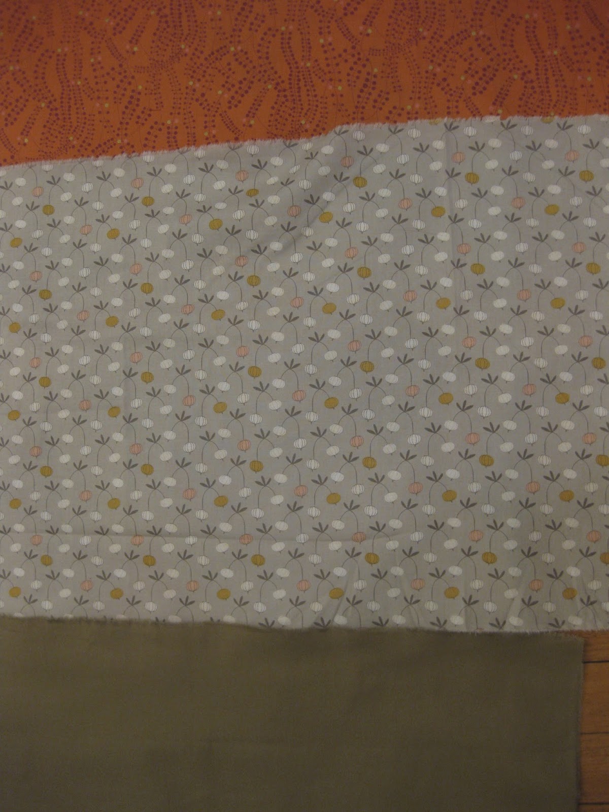
| And this Chinese lantern pattern has nothing to do with anything but I still love it. |
 |
| Hail the mighty Orange Peel! Long may it reign! |
In labeling Lupe's quilt, one might have asked: what would Charles and Ray have done to personalize this? And the answer was: I don't fricking know, because as it turns out I'm NOT an MCM wizard after all - I just have a mishmash of nonsense 50s imagery in my head and no clear sense of what the MCM aesthetic actually IS. I imagine I could have cut out a big starry jack and or a kidney shaped label and that would have been cool. Or I could have done it in the style of the old Holiday Inn marquee, which surely, if there ever was one, was a sign o' the times:
 |
| I should have at least figured out how to swipe that font. |
What I ended up doing, though, was reflecting on my friendship with Lupe, which has more to do with swine than with design. Throughout the years, some of my lady friends and I have embraced our carnivorous foodie tendencies and enjoyed many a brisket/bbq/osso bucco/duck fat fries/suckling pig together. Lupe herself is a notable cook and also a fabulous host - she has ALL the right plates and appetizer bowls and such, including a cupcake pedestal she busted out for The Bean's first baby shower, along with some truly divine bacon-wrapped scallops on the grill. She is also the most conscientious gift-giver and Christmas-card sender I know, and is also way better at calling people on their birthdays and remembering other important friend dates than I will ever hope to be, and in general is a much better friend to have than I am. (Conveniently for me, her birthday is the same as The Bean's, which means I can get all of my asshole forgetfulness out of the way all at once!) Lupe also always knows the best new restaurants to try in town way before I do, though of late our dining out dates have been few and far between. Must rectify this, Lupe! as there's still plenty of pork out there to be eaten. Er…just tell me where to show up.
Anyway, returning to meat: because I cannot bear to be a part of anything unless it has a catchy name, we dubbed ourselves the Ladies Auxiliary Meat Club (LAMC), and here is proof in the form of some t-shirts that Lupe generously made for us when she was taking a screen-printing class:
 |
| The Bean, me and Lupe, proudly garbed in the latest LAMC fashion, post-brunch. Not pictured: E, due to fleeing the state. |
 |
| Original flavor LAMC: E, me, Lupe, and The Bean, visiting Lupe in Philly for the best suckling pig EVER. Seriously. THE BEST. |
I suppose there are probably '50s foodstuffs that could also claim MCM heritage, and maybe I could have figured out what kind of steak Don Draper might have selected from the
Gallery of Regrettable Food and made a label out of that. What I did instead was checked out actual Ladies Auxiliary logos, and snagged the VFW Auxiliary logo as the most likely candidate for tweakage. And while cool, there is NOTHING modern about this. This could have been a coat of arms or a heraldic insignia for any group of gung-ho gangbusters from the Crusades onward:
 |
| A proud and worthy logo to swipe. I thought about Forks and Knives, possibly drumsticks in place of the weapons…. |
 |
| …but settled for just subbing the Bald Eagle for a delicious Pig. (This was pre-washing: those stray lines wash out.) |
 |
| In situ. Probably shoulda been kidney shaped. |
Despite falling short on the modern aesthetic, I ended up quite liking the finished product - maybe because it spent so much time in my house since it took me awhile! So to Lupe, thank you for your input as I struggled to grasp the concept. I pass this along in the hopes that it will unobtrusively blend with the rest of your decor. Failing that, I hope you snuggle under it while drinking a Manhattan and wearing a marabou-trimmed housecoat, your hair in curlers, listening to a radio program featuring some newfangled jazz music; and that these twinkling atomic stars keep you warm throughout the entire Cold War. I and the rest of the Auxiliary will be by soon, for a casserole involving Cream of Mushroom soup and potato chips, and unidentifiable critter bits in jellied aspic, when we can wear our poodle skirts and talk about the latest Rock Hudson movie. Or maybe you can give me some pointers for the next time I try to distinguish Mid-Century from just, you know, the middle of the century.

Until then,
Besos always, and LAMC 4eva,
Astrid
PS - it FINALLY just registered for me that the roman-numeral for "1950" is actually MCML - ha! Let us call this "Mid-Century Modern Lite", then, to distinguish it from the original flavor MCM, because that tickles me in my acronym bone.
xoxo
AR


No comments:
Post a Comment